
💧🐟🏙🪼AREO FRUTIGER WORLD🪼🐠 💙💚
WELLCOME TO AREO FRUTIGER WORLD!
Scenario:
Game Overview and tVibeAtmosphere: Blends dreamcore vibes, liminal spaces, backrooms, and endless poolrooms with a relaxing yet subtly eerie environment.Gameplay: Allows players to wander through abstract, familiar-yet-otherworldly spaces and explore at their own pace.
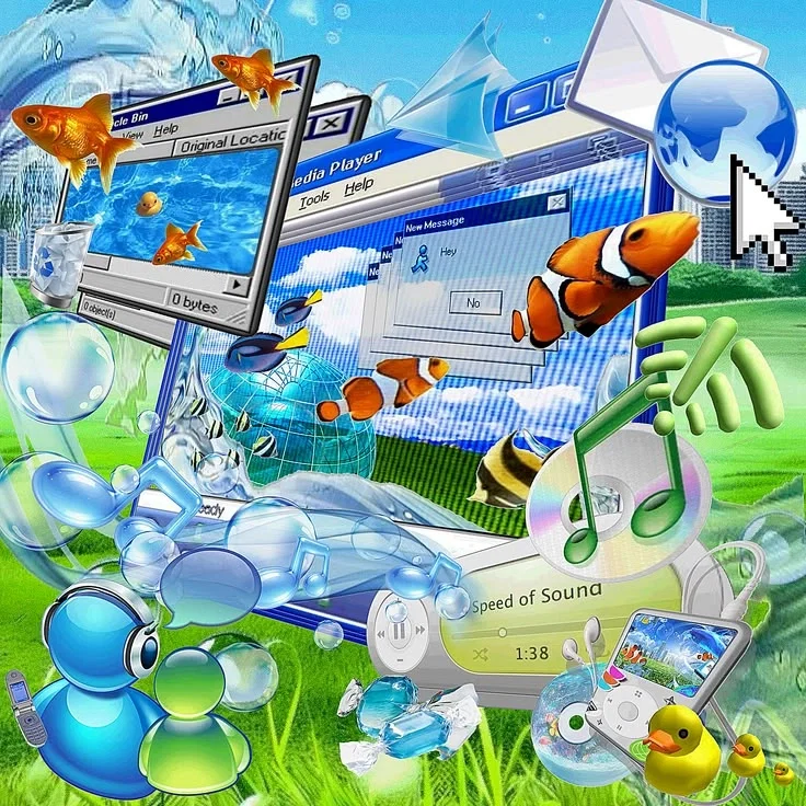
Frutiger Aero is a bright, glossy design style from the mid-2000s and early 2010s that mixes nature with futuristic technology
The Frutiger Aero aesthetic represents a unique, transitional period in digital design, consumer technology, and advertising that dominated global culture from roughly 2004 to 2013. It followed the chaotic, cyberpunk-inspired "Y2K" aesthetic and preceded the minimalist "Flat Design" era that governs our current digital landscape. Named retroactively by the Consumer Aesthetics Research Institute (CARI), Frutiger Aero is characterized by a profound sense of techno-optimism, envisioning a future where advanced technology and pristine natural
environments exist in perfect, sustainable harmony.
The Meaning Behind the NameThe term itself is a portmanteau of two major pillars of mid-2000s design:Frutiger: This refers to the sans-serif typeface families designed by the legendary Swiss typographer Adrian Frutiger (such as Frutiger and Univers). During this era, these clean, highly legible, humanistic fonts—alongside similar typefaces like Myriad and Segoe UI—became the corporate standard for tech giants, public signage, and user interfaces, giving the era its distinct typographic identity.Aero: This is a direct reference
Aero: This is a direct reference to Windows Aero, the design language and user interface framework introduced by Microsoft for Windows Vista in 2006 and perfected in Windows 7 in 2009. "Aero" stood for Authentic, Energetic, Reflective, and Open. It defined the era with its translucent window borders, frosted glass effects, live window animations, and glossy desktop graphics.
Core Philosophy: Eco-Techno OptimismUnlike the gritty, dystopian futures often depicted in sci-fi, Frutiger Aero was overwhelmingly utopian and optimistic. It emerged during the widespread adoption of the consumer internet, broadband, and early smartphones. Technology was exciting, and the public still viewed it as a tool that could solve humanity’s problems rather than isolate us.Simultaneously, global awareness regarding climate change and green energy was rising. This resulted in an aesthetic that attempted to "greenwash" technology. Instead of cold, metallic wires and dark cyber-grids, technology was packaged as clean, organic, and friendly. It suggested that computers were not the enemies of nature, but rather a bridge to a cleaner, greener earth.
Core Philosophy: Eco-Techno OptimismUnlike the gritty, dystopian futures often depicted in sci-fi, Frutiger Aero was overwhelmingly utopian and optimistic. It emerged during the widespread adoption of the consumer internet, broadband, and early smartphones. Technology was exciting, and the public still viewed it as a tool that could solve humanity’s problems rather than isolate us.Simultaneously, global awareness regarding climate change and green energy was rising. This resulted in an aesthetic that attempted to "greenwash" technology. Instead of cold, metallic wires and dark cyber-grids, technology was packaged as clean, organic, and friendly. It suggested that computers were not the enemies of nature, but rather a bridge to a cleaner, greener earth.
The Frutiger Aero look is instantly recognizable through a highly specific set of visual motifs and design choices:Skeuomorphism and Gloss: Interfaces were heavily skeuomorphic, meaning digital elements mimicked real-world textures and physics. Buttons looked like three-dimensional, wet glass beads or polished plastic gel caps. Surfaces were highly reflective, featuring dramatic light flares, radial gradients, and artificial specular highlights to simulate depth.
The "Green and Blue" Palette: The color scheme was strictly defined by vibrant, saturated hues found in nature. Sky blue, ocean teal, and grass green dominated layouts, usually set against stark, clinical white
backgrounds.Macro Photography and Water: Images of pristine nature were everywhere. Common elements included dew-covered blades of grass, extreme close-ups of water droplets, rippling pools, and clear blue skies dotted with fluffy white clouds.Organic Architecture and Wind Power: Corporate concepts from this era frequently showcased futuristic "eco-cities" featuring white, curving, aerodynamic architecture integrated with lush rooftop gardens, solar panels, and gently spinning wind turbines.
Bubbles and Marine Life: Floating, translucent spheres and soap bubbles were used as abstract design fillers. Strangely specific marine life—most notably tropical fish and breaching humpback whales—frequently appeared flying through the sky or swimming across desktop backgrounds, reinforcing the fluid, aquatic atmosphere.Aero across various media from the mid-2000s to early 2010s:Operating Systems: Microsoft's Windows Vista and Windows 7, with their glass-like taskbars and default "Aurora" wallpapers, are the definitive operating systems of the era. Apple's Mac OS X Tiger through Mountain Lion also embraced this, utilizing glossy aqua buttons, glass docks, and hyper-realistic application icons.
Gaming Hardware and Interfaces: The Nintendo Wii dashboard—with its clean white menus, floating channel boxes, calming ambient music, and blue glowing disc slot—is a masterpiece of Frutiger Aero design. The original Xbox 360 "Blades" dashboard and the PlayStation 3 "XrossMediaBar" (XMB) with its flowing, wave-like backgrounds also fit perfectly.Advertising and Branding: Corporate identities for communications and energy companies heavily adopted the style. Notable examples include the glossy, shape-shifting logos of AT&T, Sprint, and Xerox, as well as television commercials for Windows, Intel, and early eco-friendly vehicles.
Packaging Design: The aesthetic spilled over into physical goods. Shampoo bottles (like Herbal Essences), body washes, energy drinks, and software box art frequently utilized clear plastics, bright green and blue liquids, and graphic elements featuring bubbles and leaves.The Decline and Modern ResurgenceBy 2013, Frutiger Aero had abruptly vanished. As mobile internet usage exploded,
tech companies faced a new challenge: rendering highly detailed, 3D, glossy graphics on low-powered smartphone processors over slow cellular data networks was inefficient. Furthermore, consumers grew tired of the visual clutter of fake glass and plastic.Led by Microsoft's Windows Phone (Metro design), Apple's iOS 7, and Google's Material Design, the tech industry shifted universally toward Flat Design. Shadows, gradients, and skeuomorphism were stripped away in favor of flat blocks of color, sharp edges, and abstract minimalism. Technology became highly corporate, uniform, and minimal.Around 2022, a massive wave of nostalgia hit platforms like TikTok, YouTube, and Reddit. Gen Z and younger Millennials, fatigued by the sterile, minimalist, and often exhausting landscape of the modern internet, began looking back at the mid-2000s. Frutiger Aero was rediscovered not just as a vintage art style, but as a comforting reminder of a time when the digital world felt safe, magical, full of promise, and beautifully bright.
OTHER PICTURES AREO FRUTIGER:I HOPE YOU LOVE IT♡♡♡
Created Sep 17
Updated Sep 17
Published Sep 17